The clock may display either world time or local time, depending on your needs. There are two different kinds of clocks: analog and digital.
Suppose you are looking for a designer or developer to design an analog clock for your website. This article is beneficial for you.
A real-time clock is a highly important component for websites when time is a factor. On the real-time analog clock, the hours, minutes, and seconds are represented by three hands. You may use custom visuals of the clock hands and dial to match the user interface of the website.
Also Read: Create HTML5 Fullscreen Video Background Using CSS
Let’s see a step-by-step process to build a real-time Analog Clock using HTML, CSS, and JavaScript.
Step 1: Create the basic structure of the clock using HTML
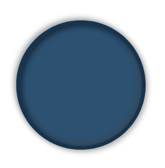
Let’s create an index.html page to create an analog clock basic structure with HTML and CSS
Copy and paste the following code to the index.html page under the <body> tag
|
2 3 4 5 6 7 8 9 10 11 |
<div class="clock"> <div class="outer-clock-face"> <div class="marking marking-one"></div> <div class="marking marking-two"></div> <div class="marking marking-three"></div> <div class="marking marking-four"></div> </div> </div> |
CSS: Copy and paste the following css to the index.html page under the <head> tag
|
2 3 4 5 6 7 8 9 10 11 12 13 14 15 16 17 18 19 20 21 22 23 24 25 26 27 28 29 30 31 32 33 |
html { text-align: center; font-size: 10px; } body { margin: 0; font-size: 2rem; display: flex; flex: 1; min-height: 100vh; align-items: center; } .clock { background: #2d5171; width: 20rem; height: 20rem; position: relative; padding: 2rem; border: 7px solid #16344f; box-shadow: -4px -4px 10px rgba(67,67,67,0.5), inset 4px 4px 10px rgba(0,0,0,0.5), inset -4px -4px 10px rgba(67,67,67,0.5), 4px 4px 10px rgba(0,0,0,0.3); border-radius: 50%; margin: 50px auto; } |
Output:

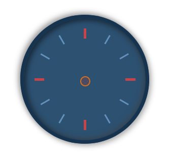
Step 2: Draw two colorful marks from 1 to 12 on the clock
Copy and paste the following HTML and CSS codes to make the colorful symbol that I used to indicate the time from 1 to 12 on this watch.
|
2 3 4 5 6 7 8 9 10 11 12 |
<div class="outer-clock-face"> <div class="marking marking-one"></div> <div class="marking marking-two"></div> <div class="marking marking-three"></div> <div class="marking marking-four"></div> <div class="inner-clock-face"> </div> </div> |
|
2 3 4 5 6 7 8 9 10 11 12 13 14 15 16 17 18 19 20 21 22 23 24 25 26 27 28 29 30 31 32 33 34 35 36 37 38 39 40 41 42 43 44 45 46 47 48 49 50 51 52 53 54 55 56 57 58 59 60 61 62 63 64 65 66 67 68 69 70 71 72 73 74 75 76 77 78 79 80 81 82 83 84 85 |
.outer-clock-face { position: relative; background: #2d5171; overflow: hidden; width: 100%; height: 100%; border-radius: 100%; } .outer-clock-face::after { -webkit-transform: rotate(90deg); -moz-transform: rotate(90deg); transform: rotate(90deg) } .outer-clock-face::after, .outer-clock-face::before, .outer-clock-face .marking{ content: ''; position: absolute; width: 5px; height: 100%; background: #c8444a; z-index: 0; left: 49%; } .outer-clock-face .marking { background: #6391bb; width: 3px; } .outer-clock-face .marking.marking-one { -webkit-transform: rotate(30deg); -moz-transform: rotate(30deg); transform: rotate(30deg) } .outer-clock-face .marking.marking-two { -webkit-transform: rotate(60deg); -moz-transform: rotate(60deg); transform: rotate(60deg) } .outer-clock-face .marking.marking-three { -webkit-transform: rotate(120deg); -moz-transform: rotate(120deg); transform: rotate(120deg) } .outer-clock-face .marking.marking-four { -webkit-transform: rotate(150deg); -moz-transform: rotate(150deg); transform: rotate(150deg) } .inner-clock-face { position: absolute; top: 10%; left: 10%; width: 80%; height: 80%; background: #2d5171; -webkit-border-radius: 100%; -moz-border-radius: 100%; border-radius: 100%; z-index: 1; } .inner-clock-face::before { content: ''; position: absolute; top: 50%; left: 50%; width: 16px; height: 16px; border-radius: 18px; margin-left: -9px; margin-top: -6px; background: #4d4b63; z-index: 11; border: 2px solid #d9701b; } |
Output

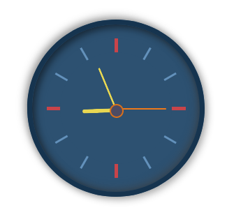
Step 3: Draw three hands to indicate the time on the clock
Let’s draw three hands to indicate the hours, minutes, and seconds, much like an older analog clock. I designed those hands using the HTML and CSS code provided below.
|
2 3 4 5 6 |
<div class="hand hour-hand"></div> <div class="hand min-hand"></div> <div class="hand second-hand"></div> |
We will add above code under “<div class=”inner-clock-face”></div>” tag
|
2 3 4 5 6 7 8 9 10 11 12 13 14 15 16 17 18 19 20 21 22 23 24 25 26 27 28 29 30 31 32 |
.hand { width: 50%; right: 50%; height: 6px; background: #e8d752; position: absolute; top: 50%; border-radius: 6px; transform-origin: 100%; transform: rotate(90deg); transition-timing-function: cubic-bezier(0.1, 2.7, 0.58, 1); } .hand.hour-hand { width: 30%; z-index: 3; } .hand.min-hand { height: 3px; z-index: 10; width: 40%; } .hand.second-hand { background: #ee791a; width: 45%; height: 2px; } |
Output

Are you want to get implementation help, or modify or extend the functionality?
A Tutorialswebsite Expert can do it for you.
Step 4: Activate the analog clock with JavaScript code
The design for the analog watch was completed. Now, I will use JavaScript to make this watch functional. On this watch, JavaScript has only been used to execute the hands.
Remember, I did not use any JavaScript libraries or plugins in this case.
Copy and paste the following javascript code before </body> tag.
|
2 3 4 5 6 7 8 9 10 11 12 13 14 15 16 17 18 19 20 21 22 23 24 25 26 27 28 |
<script> const secondHand = document.querySelector('.second-hand'); const minsHand = document.querySelector('.min-hand'); const hourHand = document.querySelector('.hour-hand'); function setDate() { const now = new Date(); const seconds = now.getSeconds(); const secondsDegrees = ((seconds / 60) * 360) + 90; secondHand.style.transform = `rotate(${secondsDegrees}deg)`; const mins = now.getMinutes(); const minsDegrees = ((mins / 60) * 360) + ((seconds/60)*6) + 90; minsHand.style.transform = `rotate(${minsDegrees}deg)`; const hour = now.getHours(); const hourDegrees = ((hour / 12) * 360) + ((mins/60)*30) + 90; hourHand.style.transform = `rotate(${hourDegrees}deg)`; } setInterval(setDate, 1000); setDate(); </script> |
Suggested Read: How to generate dynamic QR code using PHP
Wrapping Words!
Thanks for reading 🙏, I hope you found the How to Create an Analog Clock using HTML, CSS, and JavaScript tutorial helpful for your project. Keep learning! If you face any problems – I am here to solve your problems.
I found this article on: https://dev.to/code_mystery/simple-analog-clock-using-html-css-javascript-2c6a

Pradeep Maurya is the Professional Web Developer & Designer and the Founder of “Tutorials website”. He lives in Delhi and loves to be a self-dependent person. As an owner, he is trying his best to improve this platform day by day. His passion, dedication and quick decision making ability to stand apart from others. He’s an avid blogger and writes on the publications like Dzone, e27.co


