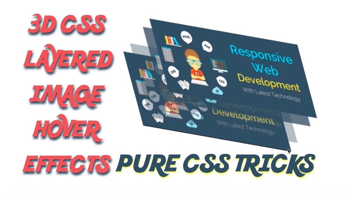
CSS3 has launched an extremely large web design change. Today we will use the transformation elements of CSS to produce a combined effect of 3D CSS animation. You’re going to see how CSS transitions and CSS transform can make things look cool.
In this article, you will get all the information that is required to create CSS 3d Layered Image Hover Effects design. You need to follow below steps:
Create ( index.html ) file and copy and paste below code
|
2 3 4 5 6 7 8 9 10 11 12 13 14 15 16 17 18 |
<!doctype html> <html> <head> <title>3D CSS Image Layred Hover Effect</title> </head> <body> <div class="container"> <img src="business-explore.png" alt="3d css"> <img src="business-explore.png" alt="3d css"> <img src="business-explore.png" alt="3d css"> <img src="business-explore.png" alt="3d css"> </div> </body> </html> |
Now give the body tag the following style.
|
2 3 4 5 6 7 8 9 10 11 12 |
body{ margin: 0px; padding: 0px; width: 100%; height: 100%; display: flex; align-items: center; justify-content: center; } |
CSS transition features are used just like animation to get a smooth effect. Now give the following CSS to the container class.
|
2 3 4 5 6 7 8 9 10 11 12 13 14 |
.container{ position: relative; width: 600px; height: 247px; margin-top: 200px; background: rgba(0,0,0,1); transform: rotate(-10deg) skew(30deg) scale(0.9); transition: 0.5s; border-radius:10px; box-shadow:0 0 15px 0 #555; } |
Now put the following styles in your file to create effect on 4 images
|
2 3 4 5 6 7 8 9 10 11 12 13 14 15 16 17 18 19 20 21 22 23 24 25 26 27 28 29 |
.container img{ position: absolute; width: 100%; transition: 0.5s; cursor: pointer; border-radius:10px; box-shadow:0 0 15px 0 #555; } .container:hover img:nth-child(4){ transform: translate(160px, -160px); opacity: 1; } .container:hover img:nth-child(3){ transform: translate(120px, -120px); opacity: 0.8; } .container:hover img:nth-child(2){ transform: translate(80px, -80px); opacity: 0.6; } .container:hover img:nth-child(1){ transform: translate(40px, -40px); opacity: 0.4; } |
Complete Code :
|
2 3 4 5 6 7 8 9 10 11 12 13 14 15 16 17 18 19 20 21 22 23 24 25 26 27 28 29 30 31 32 33 34 35 36 37 38 39 40 41 42 43 44 45 46 47 48 49 50 51 52 53 54 55 56 57 58 59 60 61 62 63 64 65 66 67 |
<!doctype html> <html> <head> <title>3D CSS Image Layred Hover Effect</title> <style type="text/css"> body{ margin: 0px; padding: 0px; width: 100%; height: 100%; display: flex; align-items: center; justify-content: center; } .container{ position: relative; width: 600px; height: 247px; margin-top: 200px; background: rgba(0,0,0,1); transform: rotate(-10deg) skew(30deg) scale(0.9); transition: 0.5s; border-radius:10px; box-shadow:0 0 15px 0 #555; } .container img{ position: absolute; width: 100%; transition: 0.5s; cursor: pointer; border-radius:10px; box-shadow:0 0 15px 0 #555; } .container:hover img:nth-child(4){ transform: translate(160px, -160px); opacity: 1; } .container:hover img:nth-child(3){ transform: translate(120px, -120px); opacity: 0.8; } .container:hover img:nth-child(2){ transform: translate(80px, -80px); opacity: 0.6; } .container:hover img:nth-child(1){ transform: translate(40px, -40px); opacity: 0.4; } </style> </head> <body> <div class="container"> <img src="business-explore.png" alt="3d css"> <img src="business-explore.png" alt="3d css"> <img src="business-explore.png" alt="3d css"> <img src="business-explore.png" alt="3d css"> </div> </body> </html> |
Are you want to get implementation help, or modify or extend the functionality of this script? Submit paid service request

Pradeep Maurya is the Professional Web Developer & Designer and the Founder of “Tutorials website”. He lives in Delhi and loves to be a self-dependent person. As an owner, he is trying his best to improve this platform day by day. His passion, dedication and quick decision making ability to stand apart from others. He’s an avid blogger and writes on the publications like Dzone, e27.co


