
If you are a website designer or developer and looking for best option to convert checkbox lists into dropdown on mobile device then this article is very important for you.
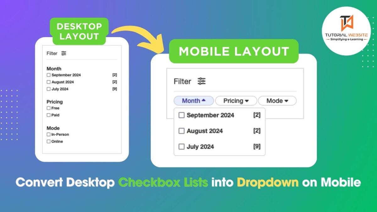
In today’s mobile-first world, providing a seamless user experience across all devices is essential. Forms that work well on desktop can sometimes feel clunky or overwhelming on smaller screens. One common scenario is using checkbox lists in forms, which are great on desktops but can take up too much space on mobile devices. A solution? Converting checkbox lists into dropdown for mobile users while keeping the original checkbox interface for desktop.
Suggested Read: Upload Multiple Files using JavaScript and PHP with Real-Time Validation
This article will guide you through a simple process to convert a checkbox list into a dropdown on mobile devices, ensuring your forms remain user-friendly regardless of the device being used.
Why Convert Checkbox Lists into Dropdown?
Checkboxes are useful when allowing users to select multiple options. However, on mobile screens, long lists of checkboxes can be cumbersome and take up too much vertical space. A dropdown allows users to tap and expand the options only when needed, creating a cleaner and more compact form layout.
The combination of checkboxes and dropdowns enhances usability across devices:
Desktop: Checkbox lists are easier to scan and interact with.
Mobile: Dropdown keep the interface clean and prevent overwhelming the user with too many options at once.
Step-by-Step Guide to Converting Checkbox Lists into Dropdown on Mobile for a Seamless User Experience
Are you want to get implementation help, or modify or extend the functionality?
A Tutorialswebsite Expert can do it for you.
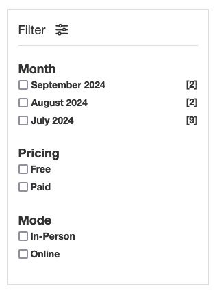
Step-1: HTML Structure for the Checkbox List
To start, you need a standard checkbox list. Here’s an example of a basic list:
|
2 3 4 5 6 7 8 9 10 11 12 13 14 15 16 17 18 19 20 21 22 23 24 25 26 27 28 29 30 31 32 33 34 35 36 37 38 39 40 41 42 43 44 45 46 47 48 49 50 51 52 53 54 55 |
<div class="filter"> <div class="filtertitle"> <p>Filter <i class="fa-solid fa-sliders"></i></p> </div> <form class="filterForm" id="filterForm" method="get"> <div class="filterOption"> <div class="OptionTitle"> Month <i class="fa-solid fa-caret-down"></i> </div> <div class="OptinValue monthyear"> <label> <input type="checkbox" class="month_year" name="month_year[]" value="2024-09">September 2024 <span class="filterMYCount">[2]</span></label> <label> <input type="checkbox" class="month_year" name="month_year[]" value="2024-08">August 2024 <span class="filterMYCount">[2]</span></label> <label> <input type="checkbox" class="month_year" name="month_year[]" value="2024-07">July 2024 <span class="filterMYCount">[9]</span></label> </div> </div> <div class="filterOption"> <div class="OptionTitle"> Pricing <i class="fa-solid fa-caret-down"></i> </div> <div class="OptinValue"> <label> <input type="checkbox" class="filtpricing" name="pricing[]" value="free"> Free </label> <label> <input type="checkbox" class="filtpricing" name="pricing[]" value="paid"> Paid </label> </div> </div> <div class="filterOption"> <div class="OptionTitle"> Mode <i class="fa-solid fa-caret-down"></i> </div> <div class="OptinValue"> <label> <input type="checkbox" class="filtmode" name="mode[]" value="in-person"> In-Person</label> <label> <input type="checkbox" class="filtmode" name="mode[]" value="online"> Online</label> </div> </div> </form> </div> |
This creates a simple filter with list of checkboxes that works well on desktop.
Also Read: How to Convert a Timestamp to a “Time Ago” Format in PHP
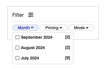
Step-2: Styling the Layout for Desktop and Mobile
The goal is to display the layout of checkboxes as a regular list on desktop, but convert them into a dropdown on mobile. To achieve this, we use CSS media queries to apply different styles based on the screen size.
Here’s the CSS:
|
2 3 4 5 6 7 8 9 10 11 12 13 14 15 16 17 18 19 20 21 22 23 24 25 26 27 28 29 30 31 32 33 34 35 36 37 38 39 40 41 42 43 44 45 46 47 48 49 50 51 52 53 54 55 56 57 58 59 60 61 62 63 64 65 66 67 68 69 70 71 72 73 74 75 76 77 78 79 80 81 82 83 84 85 86 87 88 89 90 91 92 93 94 95 96 97 98 99 100 101 102 103 104 |
.filter { padding: 15px; border: 2px solid #ddd; height: auto; text-align:left; } .filtertitle { font-size: 18px; } .filtertitle p { margin-bottom: 10px; border-bottom: 1px solid #ddd; padding-bottom: 10px; } .filtertitle i { font-size: 18px; margin-left: 10px; } .filterForm .filterOption { margin-top: 20px; } .filterForm .OptionTitle { font-size: 18px; font-weight: 600; } .OptinValue { display: grid; } .OptinValue .month_year { margin-right: 5px; } .filterMYCount { float: right; } .OptionTitle .fa-caret-down { display: none; } @media (min-width:320px) and (max-width:768px){ .filterForm .filterOption{ margin-top:0px; } .filterForm { display: flex; justify-content: space-between; } .filterOption { display: inline-block; } .OptionTitle { padding: 0px 18px; border: 1px solid #C3C3C3; cursor: pointer; border-radius:20px; } .OptinValue { display: none; position: absolute; background-color: #fff; min-width: auto; border: 1px solid #ccc; z-index: 1; border-radius: 5px; margin-top: 5px; box-shadow: 0px 0px 4px 0px #f7f7f7; } .OptinValue.monthyear{ min-width: 210px; } .OptinValue label { display: block; padding: 5px 10px; cursor: pointer; } .OptinValue label:hover { background-color: #f1f1f1; } .OptionTitle.active{ background:#E5EDFF; color:#3B3A97; } .OptionTitle .fa-caret-down{ display:inline-block; } .OptionTitle.active .fa-solid.fa-caret-down { rotate: 180deg; } .filterForm .OptionTitle { font-size: 14px; font-weight: 500; } } |
Also Read: How to add Conditional Checkout Fields in WooCommerce
Step-3: Add JavaScript to Toggle the Dropdown on Mobile
Now, you need a way to toggle the checkbox list on mobile devices when the user clicks the title. We can achieve this using JavaScript to add and remove classes based on user interaction.
Here’s the script:
|
2 3 4 5 6 7 8 9 10 11 12 13 14 15 16 17 18 19 20 21 22 23 24 25 26 27 28 29 30 31 32 33 34 35 36 37 38 39 40 41 42 43 44 45 46 47 |
<script src="https://ajax.googleapis.com/ajax/libs/jquery/1.12.4/jquery.min.js"></script> <script> document.querySelectorAll('.OptionTitle').forEach(function(button) { button.addEventListener('click', function() { if (window.innerWidth <= 768) { const dropdownContent = this.nextElementSibling; // Toggle the dropdown visibility and add/remove 'active' class if (dropdownContent.style.display === 'grid') { dropdownContent.style.display = 'none'; this.classList.remove('active'); // Remove 'active' class when closing } else { // Close other dropdowns before opening the clicked one document.querySelectorAll('.OptinValue').forEach(function(content) { content.style.display = 'none'; }); document.querySelectorAll('.OptionTitle').forEach(function(btn) { btn.classList.remove('active'); }); dropdownContent.style.display = 'grid'; this.classList.add('active'); // Add 'active' class when opening } } }); }); // Close the dropdown when clicking outside document.addEventListener('click', function(event) { if (window.innerWidth <= 768) { if (!event.target.closest('.filterOption')) { document.querySelectorAll('.OptinValue').forEach(function(content) { content.style.display = 'none'; }); document.querySelectorAll('.OptionTitle').forEach(function(btn) { btn.classList.remove('active'); // Remove 'active' class on outside click }); } } }); </script> |
How it works
- When a user clicks on the title (
.OptionTitle), theactiveclass is toggled to change the arrow direction (up/down). - The next element (
.OptinValue, which contains the checkboxes) is either shown or hidden based on its current state. - Clicking outside the dropdown closes any open dropdown to ensure the user experience is smooth and intuitive.
Step-4: Testing and Customization
You can now test the form on both desktop and mobile devices. On desktops, the checkbox list will remain visible, while on mobile devices, the checkboxes will be hidden inside a dropdown that can be toggled.

You can further customize the appearance and behavior by adjusting the styles or adding animations when the dropdown opens and closes.
Are you want to get implementation help, or modify or extend the functionality?
A Tutorialswebsite Expert can do it for you.
Conclusion
By converting checkbox lists into dropdown on mobile, you can provide a better user experience without sacrificing functionality. Users can still select multiple options easily on both desktop and mobile, but the form remains compact and clean on smaller screens. This simple but effective solution can be implemented across a wide range of websites and applications where forms play a crucial role.
Do you want to get implementation help, or modify or extend the functionality of this script? Submit a paid service request
FAQs
Converting checkbox lists into dropdown on mobile helps reduce screen clutter, improves the user experience, and makes the interface more user-friendly by hiding unnecessary elements until needed. It ensures that your forms are more compact and easier to navigate on smaller devices.
Yes, the checkbox dropdown maintains the functionality of allowing users to select multiple options. The interface is merely condensed on mobile devices, but it retains the same multi-select feature as a standard checkbox list.
No, this solution only alters the display and layout of the checkbox list based on the screen size.
Absolutely! You can easily customize the dropdown’s appearance by adjusting the CSS.
Yes, this solution uses standard HTML, CSS, and JavaScript, which are compatible with all modern mobile browsers.
Yes, you can easily integrate this method into a WordPress theme by adding the HTML, CSS, and JavaScript code to your theme’s files or using a plugin that allows custom code. If you’re using a custom form plugin, ensure the form structure is compatible with your code.
Yes, you can integrate this solution with frameworks like Bootstrap or Tailwind CSS. However, you might need to adjust the CSS to align with the framework’s styling conventions. Both frameworks offer responsive utilities that can help further refine the dropdown behavior on mobile.

Pradeep Maurya is the Professional Web Developer & Designer and the Founder of “Tutorials website”. He lives in Delhi and loves to be a self-dependent person. As an owner, he is trying his best to improve this platform day by day. His passion, dedication and quick decision making ability to stand apart from others. He’s an avid blogger and writes on the publications like Dzone, e27.co