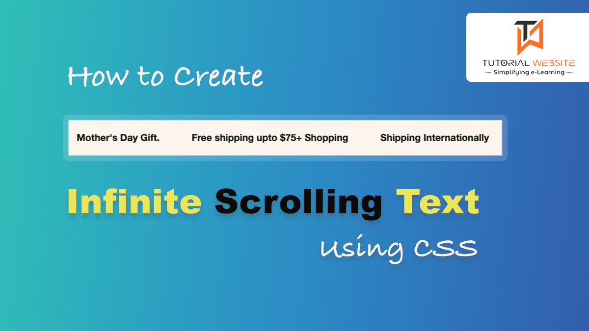
In the past, if we wanted to make text scroll in an easy way on a website, we would often use something called the ‘marquee’ tag. However, nowadays, it’s not recommended to use it because it’s outdated.
Also Read: Responsive Accordion Photo Gallery using html & css
Recently, my client asked me to create infinite scrolling text without any breaks or gaps. I initially tried using the ‘marquee’ tag and JavaScript, but I couldn’t achieve the desired result. However, after doing much research and experimenting with various CSS and JavaScript techniques, I eventually found a solution that worked.
But thanks to the cool features of modern CSS, we can achieve the same scrolling effect without needing JavaScript!
Here I am going to explain all the steps to create an infinite text scrolling effect using HTML& CSS. Here’s an example of how you can achieve this effect:
Are you want to get implementation help, or modify or extend the functionality?
A Tutorialswebsite Expert can do it for you.
Infinite Scrolling Text using CSS
Step 1: Create an index.html file
Just code and paste the below code and make the text changes according to your needs.
|
2 3 4 5 6 7 8 9 10 11 12 13 14 15 16 17 18 19 |
<div class="scrolling-container" id="text-scrolling" > <div class="scrolling-text--inner direction-left" style="--marquee-speed: 30s"> <div class="scrolling-text"> <div class="scrolling-text--item outline-text--true"><span>Mother's Day Gift.</span></div> <div class="scrolling-text--item outline-text--false"><span>Free shipping upto $75+ Shopping</span></div> <div class="scrolling-text--item outline-text--false"><span>Shipping Internationally</span></div> <div class="scrolling-text--item outline-text--false"><span>Cash on Delivery Available</span></div></div> <div class="scrolling-text"> <div class="scrolling-text--item outline-text--true"><span>Mother's Day Gift.</span></div> <div class="scrolling-text--item outline-text--false"><span>Free shipping upto $75+ Shopping</span></div> <div class="scrolling-text--item outline-text--false"><span>Shipping Internationally</span></div> <div class="scrolling-text--item outline-text--false"><span>Cash on Delivery Available</span></div></div> </div> </div> |
Step 2: Implement CSS for the scrolling effect
Copy and paste the below CSS property to beautify the layout and scrolling effect implementation. You can modify the CSS property as per your requirements.
|
2 3 4 5 6 7 8 9 10 11 12 13 14 15 16 17 18 19 20 21 22 23 24 25 26 27 28 29 30 31 32 33 34 35 36 37 38 39 40 41 42 43 44 45 46 47 48 49 50 51 52 53 54 55 56 57 58 59 60 61 62 63 64 65 66 67 68 69 70 71 72 73 74 75 76 77 78 79 80 81 82 83 84 85 86 87 88 89 90 91 92 93 94 95 96 97 98 99 100 101 102 103 104 105 106 107 108 109 |
#text-scrolling .scrolling-text--inner { font-size: 18px; } #text-scrolling {background-color:#fef5ed ; border-color: #8cc63e; margin-top:20px; padding:10px; border-radius: 10px; } .scrolling-text--item span { transition: all 0.25s cubic-bezier(0.104, 0.204, 0.492, 1); } .scrolling-text { background-color: transparent; color: #000; position: relative; background-size: cover; display: flex; align-items: center; } .scrolling-text:after { content: ""; position: absolute; bottom: 0; left: 0; right: 0; top: 0; z-index: 5; pointer-events: none; background: transparent } .scrolling-text-uppercase--true { text-transform: uppercase; } .scrolling-text--inner { display: flex; align-items: center; white-space: nowrap; font-size: 1.5rem; font-weight: 600; padding: 10px 0; overflow: hidden; position: relative; z-index: 10; } .scrolling-text--inner.direction-left > div { animation: scrollText-left var(--marquee-speed) linear infinite; } .scrolling-text--inner.direction-right > div { animation: scrollText-right var(--marquee-speed) linear infinite; } .scrolling-text--inner > div { display: flex; align-items: center; flex-shrink: 0; } .scrolling-text--item { display: inline-flex; align-items: center; padding: 0 30px; } .scrolling-text--link { display: inline-flex; align-items: center; } .scrolling-text--link span { transform-origin: left bottom; } .scrolling-text--link:hover { color: #000; } .scrolling-text--link:hover span { transform: skew(-10deg, 0); } .scrolling-text--image { margin-right: 40px; object-fit: cover; } .scrolling-text--image--small { width: 50px; height: 50px; } .scrolling-text--image--medium { width: 100px; height: 100px; } .scrolling-text--image--large { width: 200px; height: 200px; } @keyframes scrollText-left { 0% { transform: translateX(0%); } 100% { transform: translateX(-100%); } } @keyframes scrollText-right { 0% { transform: translateX(-100%); } 100% { transform: translateX(0%); } } |
In this example:
- We create a “scrolling-container” to contain the scrolling text.
- Inside the container, we have a scrolling-text element that will display the text.
- We use CSS to set the overflow of the container to hidden to hide any overflow, and we set the position of the text to absolute so it can be animated.
- We define a CSS animation named scrollText-left & scrollText-right that uses the @keyframes rule to create the scrolling effect. You can adjust the animation duration to control the speed of scrolling.
- You can replace the text inside the scrolling-text div with your own text.
Are you want to get implementation help, or modify or extend the functionality?
A Tutorialswebsite Expert can do it for you.
Wrapping Words
This code will create a horizontally scrolling text that repeats infinitely within the specified container. Adjust the height of the container and the animation duration to suit your needs.
Suggested Post
- Best Useful CSS Resources for Frontend Development
- How to create 3D Rotating Image Gallery with CSS
- CSS 3d Layered Image Hover Effects – CSS Isometric Design
- How to Create Bootstrap Carousel Slider

Pradeep Maurya is the Professional Web Developer & Designer and the Founder of “Tutorials website”. He lives in Delhi and loves to be a self-dependent person. As an owner, he is trying his best to improve this platform day by day. His passion, dedication and quick decision making ability to stand apart from others. He’s an avid blogger and writes on the publications like Dzone, e27.co


